01. Process & Research
Behind Invoice Simple
payments solution
Research methodology, the four drop-off problems, design decisions, and how each metric moved — from address verification through to checkout conversion.
02. The Foundation
Design system - the prerequisite
Before the payments work could begin properly, the platform needed a coherent foundation. Duplicated components, inconsistent accessibility standards, and divergent UI patterns were slowing development and creating user friction. I audited the entire product and built a modular design system in Figma before proceeding.
Tier 03 - Product surfaces
Invoices · Estimates · Payments · Receipts · Client portal
tier 02 - Component library
Profiles · Wallets · Contracts · Forms · Buttons · Tables · Notifications
Tier 01 - Foundations
Design tokens · Colour · Typography · Spacing · Icons · Accessibility standards
03. Research & Discovery
Finding the drop-offs
The existing third-party payment integration was failing in ways that weren’t immediately visible. I started with deep data analysis to locate exactly where users were abandoning the flow – then validated findings through workshops before committing to solutions.
01. Competitive analysis
Payments landscape
02. Drop-off data analysis
4 failure points
03. User research
Sole proprietors
04. Validation workshops
Prioritise fixes
05. Usability testing
Verify & iterate
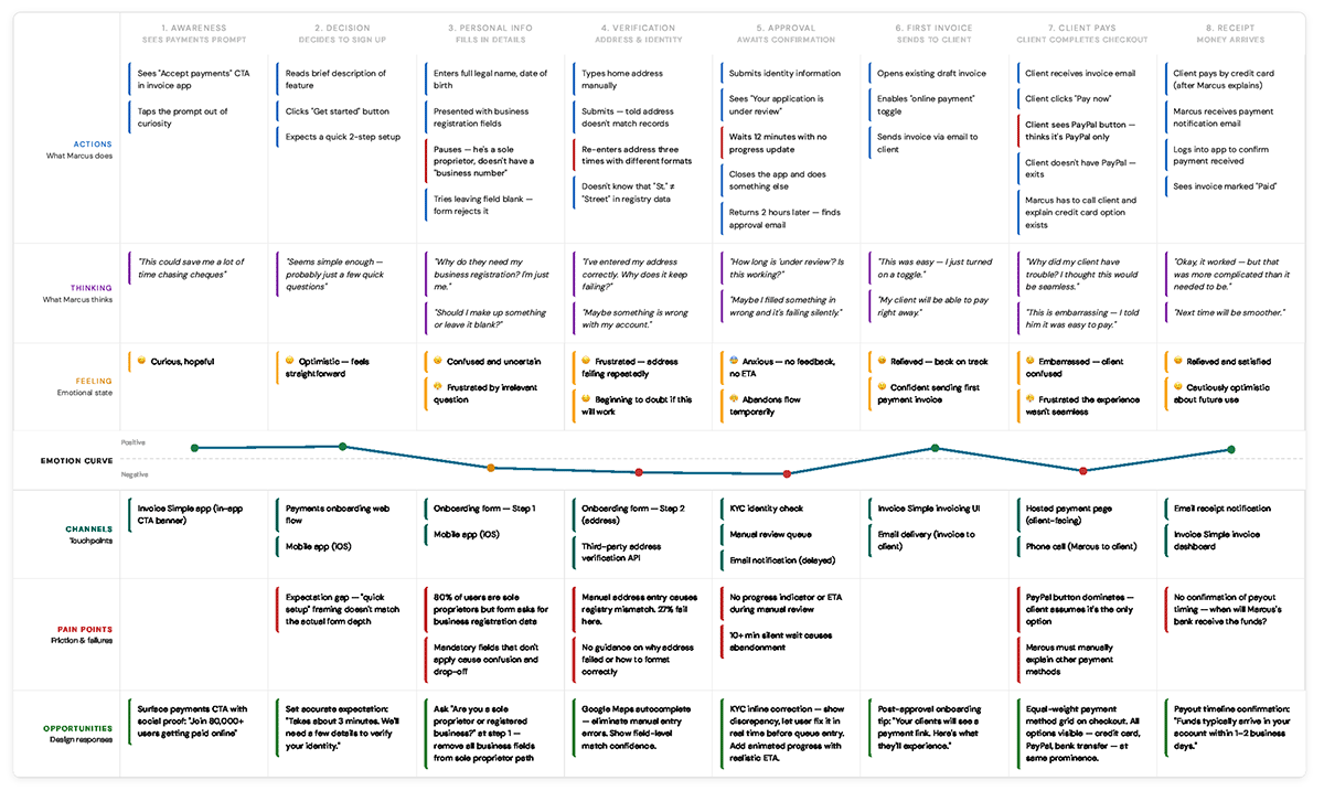
Four drop-off areas identified
Data analysis revealed four compounding failure points in the onboarding funnel. Each was addressed in sequence – fixing upstream problems first so downstream metrics would follow.
A. Personal info - sole proprietors
80% of users are sole proprietors. The flow asked for unnecessary business data, creating friction for the majority before they could proceed.
B. Business info - over-collection
The remaining 20% of business users faced overly complex requirements. Simplifying for this group reduced abandonment without affecting approval logic.
C. Instant approval - the 10-minute window
Users who didn't receive instant approval fell into a manual review queue. Targeting the auto-approval rate was critical to avoiding this drop-off.
D. Total approval rate - the downstream metric
Solving A, B, and C directly moved this primary metric. Total approval rate was the compound outcome of fixing every upstream issue.
04A. Solution 1 of 3
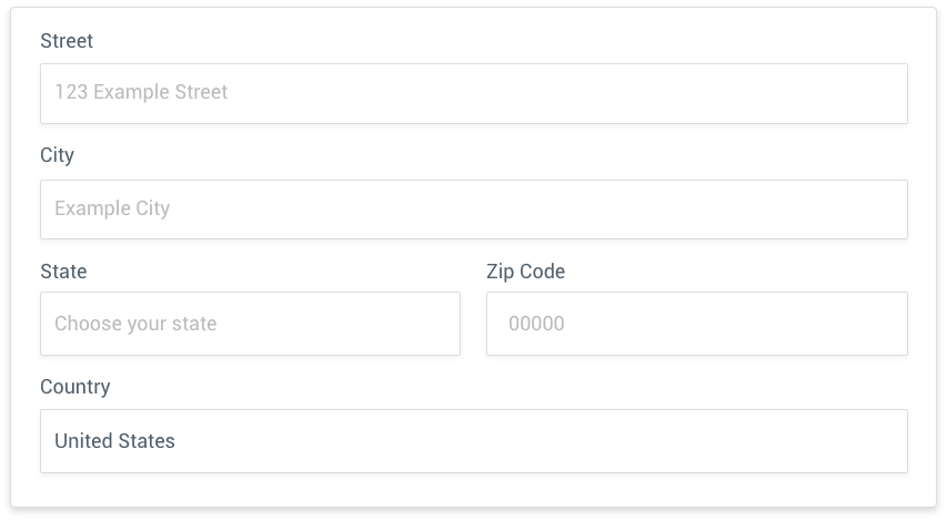
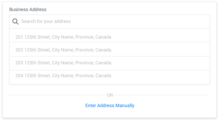
Address verification - Google Address Validation integration
Data showed users needed to match 8 of 10 data points with registry records for auto-approval. The most common failure was not bad data – it was typos. A Google Address Validation autocomplete integration eliminated the problem at the source, with minimal development effort.
"The simplest decision often moves the biggest number. Removing the ability to make a typo raised auto-approvals from 73% to 79% overnight."
04B. Solution 2 of 3
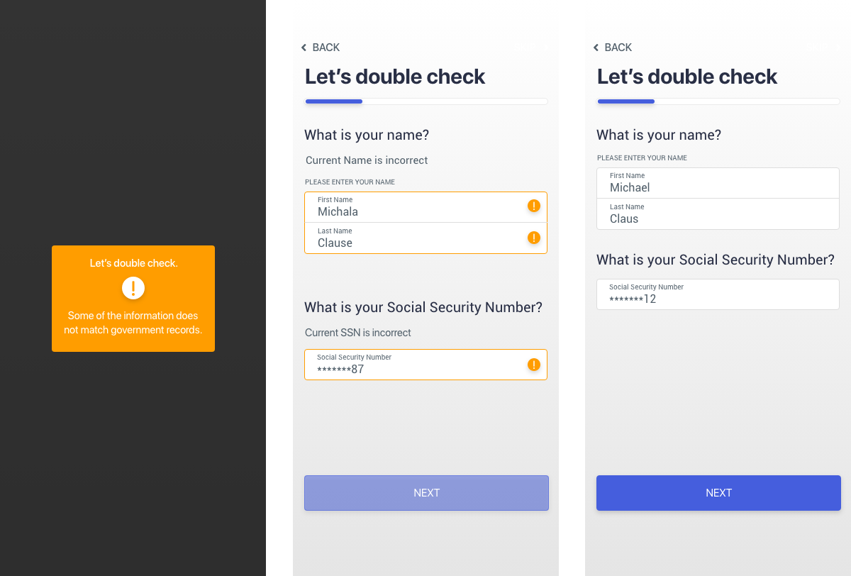
KYC integration - real-time verification
After addressing verification, the next bottleneck was identity failures. I identified and integrated a third-party KYC solution that let users fix data discrepancies in real time – before submission – rather than failing silently and entering a manual review queue.
To validate the approach before full rollout, I tested the KYC flow with a cohort of 100 users who had previously failed approval. The results justified full integration.
User submits data
System KYC Checks
Discrepancy shown inline
User fixes & resubmits
User Auto approved
04C. Solution 3 of 3
Checkout redesign - payment method clarity
With onboarding fixed, the checkout experience remained a conversion problem. Research revealed users believed PayPal was the only payment option available. By rearranging and custom-styling the payment method buttons, all options became equally visible at a glance.
"A visual hierarchy change - no new features, no new integrations - drove a 9% conversion lift within 48 hours of going live."


05. Design Process
Full lifecycle - concept to launch
Every stage was validated before moving forward. Constant testing and iteration on real-world results, not assumptions.
01. Flows - simplified onboarding
Removed redundant steps for sole proprietors. Separated personal and business paths so 80% of users no longer saw irrelevant fields.
02. Wireframes & prototypes
Built interactive Figma prototypes to test navigation, checkout clarity, and form field sequencing before any development work began.
03. Address verification - field level tracking
Rebuilt address forms with Google Maps autocomplete. Field-level tracking confirmed that registry match failures dropped from 27% to 21%.
04. KYC integration - real-time correction
Integrated third-party KYC with inline discrepancy surfacing. Tested on 100 previously-failed users before full rollout. Pushed total approvals to 93%.
05. Checkout redesign - visual hierarchy
Rearranged and custom-styled payment method buttons for equal visual weight. 9% conversion lift confirmed within 48 hours of launch.
06. Design system - ongoing consistency
Maintained the component library in parallel with delivery. All new payments UI patterns were added to the system as they shipped.
06. Reflections
What I learned
What worked
- Starting with data before designing - the four drop-off points gave a clear priority order that prevented wasted effort
- Testing KYC on a small cohort of 100 previously-failed users before full rollout - de-risked the integration at low cost
- Building the design system first meant payments UI shipped faster and more consistently than it would have otherwise
- Treating the checkout as a perception problem, not a technical one - the fix was visual hierarchy, not new functionality
What I'd do differently
- Instrument the onboarding funnel with field-level analytics earlier - we had to reconstruct some drop-off data retroactively
- Run more longitudinal retention studies - we measured conversion well but had less visibility on long-term payment behaviour
- Build the design system before, not during, the payments feature work - the parallel track added coordination overhead
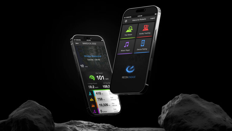
Recon Instruments
Mobile & Web Platform
Jul 2011 – Mar 2013
Led the design of Recon’s first mobile and web applications – transforming raw goggle telemetry into a connected, gamified sports platform and migrating 85% of the desktop community to mobile within a single season.
The Final Result
A community of elite snow sports athletes transitioned from a tethered desktop app to a seamless mobile and web ecosystem.
The Challenge
Recon’s hardware was pioneering — live speed, GPS, and jump data in your goggles — but the experience ended when you left the mountain. Users could only access their data on desktop, and there was no social layer to share achievements or compete with friends. The gap between the in-goggle experience and the rest of a rider’s digital life was killing retention and limiting the brand’s growth.
- Desktop-only access cut users off post-run
- Raw telemetry data had no social or gamified context
- No mobile sync meant the post-run ritual was broken
- Glove-unfriendly interfaces made on-mountain use painful


My Role
Jul 2011 – Mar 2013
Senior UX/UI Designer across a 21-month engagement. I owned the design of the Recon Engage mobile and web platforms from the ground up – establishing the design system, leading e-commerce redesign for the 2012/2013 launch, and shaping the data vizualisation experience that turned raw telemetry into social fuel.
- Product vision & go-to-market strategy
- Design system (Figma)
- Payments onboarding flows
- KYC & address verification UX
- Checkout redesign
- Usability & conversion testing
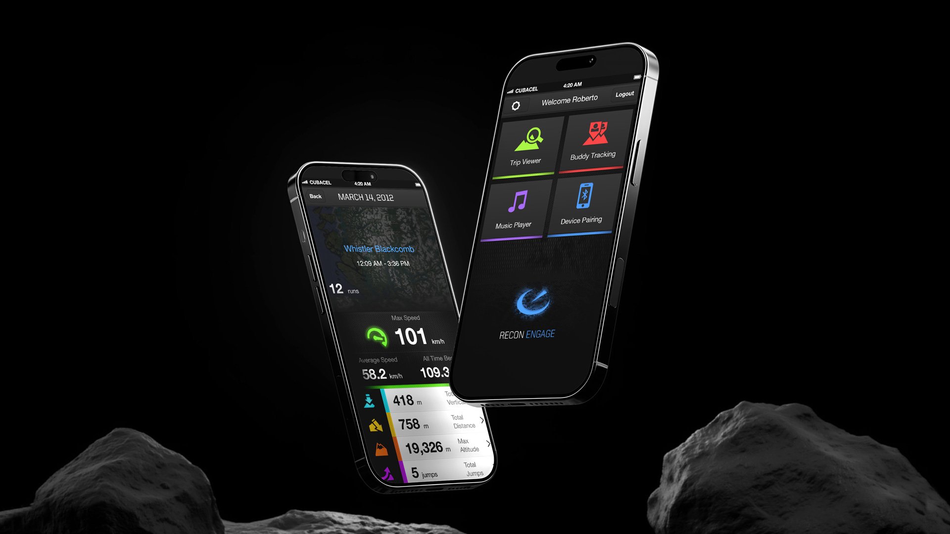
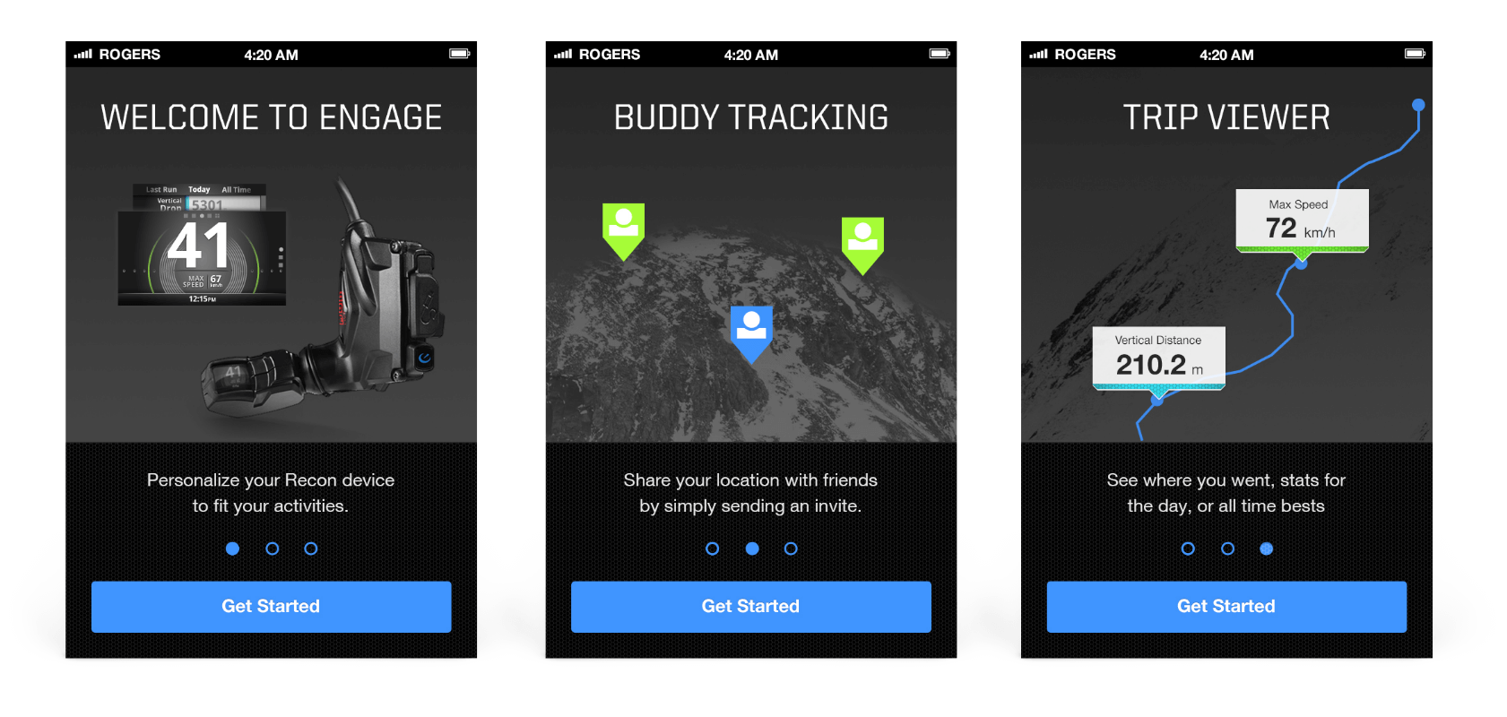
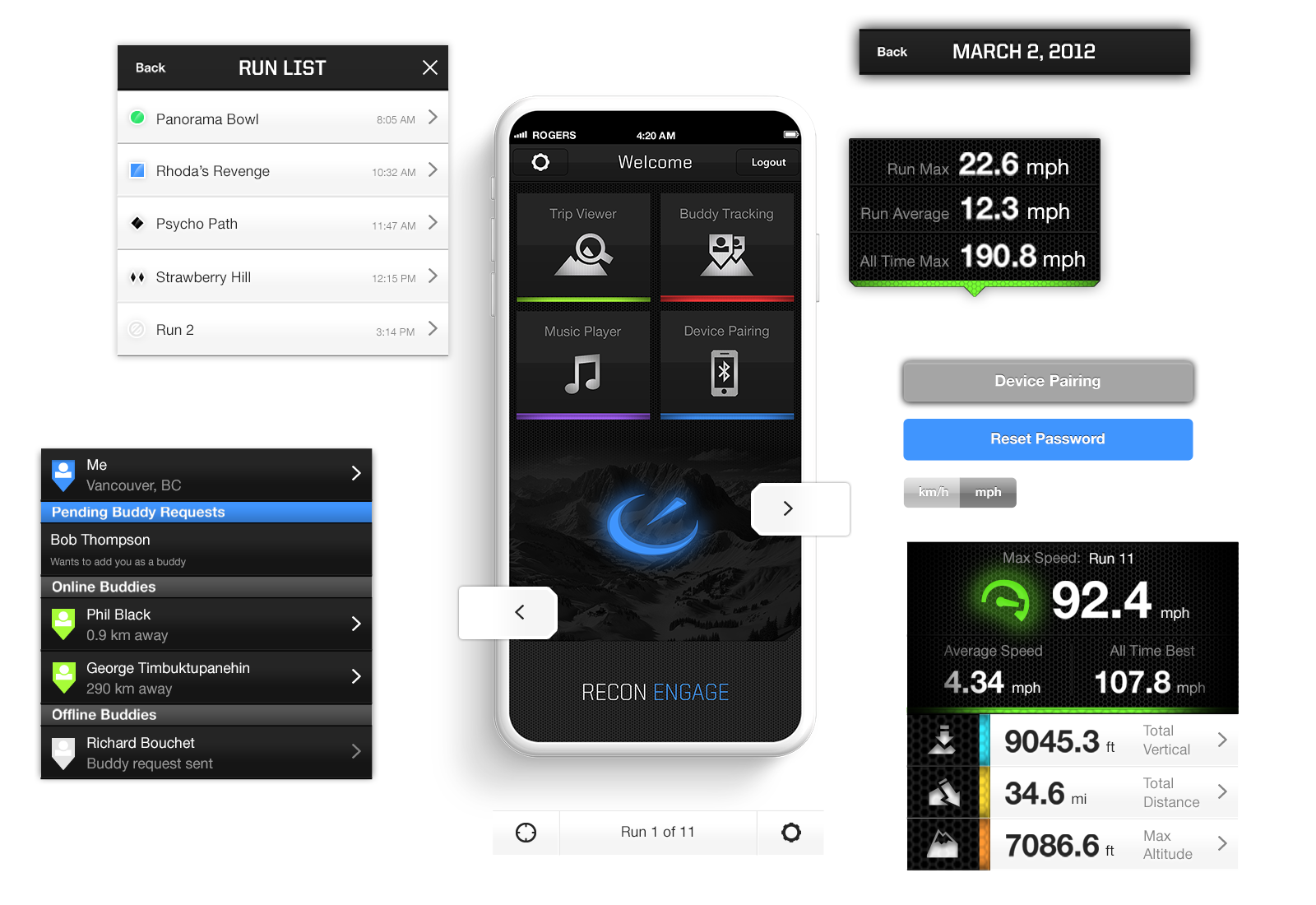
Four pillars of the platform
The Recon Engage platform was built around four interconnected features – each one extending the in-goggle experience into the rider’s broader digital life and social world.
Typography & Color Scheme
Recon’s users operated in conditions that invalidated most standard UX conventions.


From data tracker to social platform
The platform launched in time for the 2012 winter season and achieved rapid community migration. Recon’s work on wearable display UX – much of which was pioneered in this platform – positioned the company as an early leader in augmented reality, leading to its acquisition by Intel in 2015.
- 85% of Recon HQ desktop users migrated to the new mobile platform by the 2012 winter season
- Foundational design system established for Recon Engage web and mobile – scalable across all platform surfaces
- E-commerce store redesign optimised checkout and user journey for the 2012/2013 seasonal sales launch
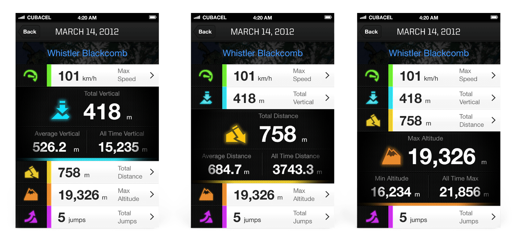
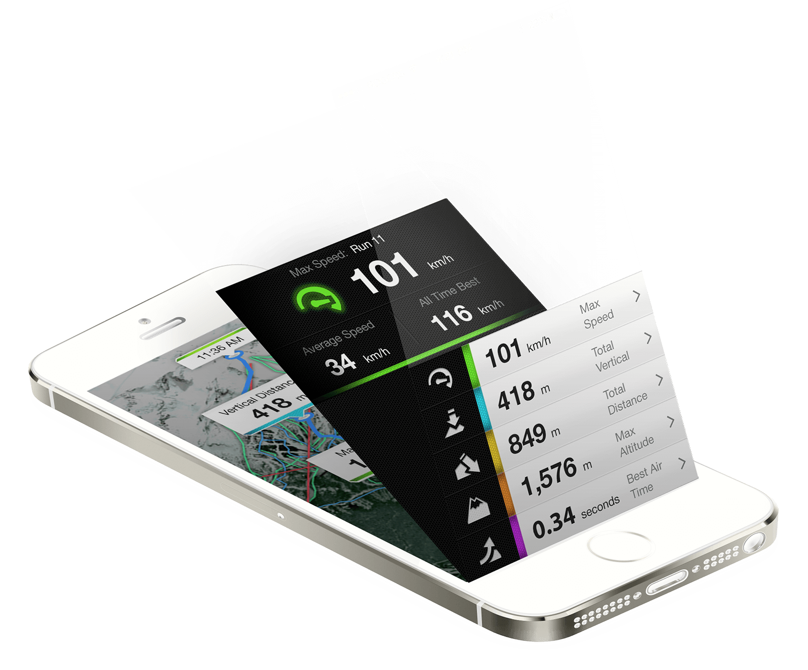
- Telemetry data transformed into social, gamified experiences – jump counts and top speeds became shareable achievements
- Virtual Remote solved the glove-usability problem that had limited on-mountain engagement with the goggle interface
- Recon acquired by Intel in 2015 – platform work positioned the brand as a leader in early AR/wearable tech
Want to see how it was built?
The process page covers the contextual field research, how telemetry data was designed for social consumption, the design system architecture, and the e-commerce redesign approach.