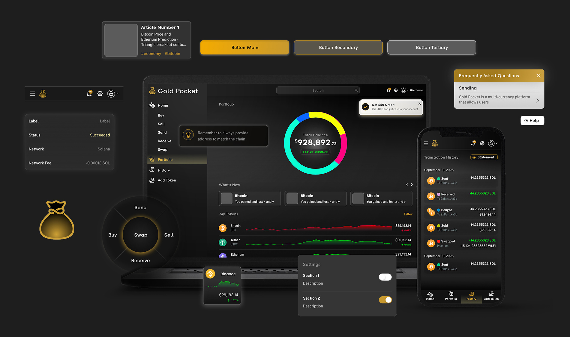
Gold Pocket
MVP for crypto wallet app
Designing a mainstream-friendly way to buy, sell, swap, send, and receive value across fiat and crypto.
Project Overview
Gold Pocket is a consumer fintech platform designed to bridge the gap between traditional finance and digital assets. It allows users to convert between fiat currencies like USD or CAD and digital assets such as BTC and USDC. The primary goal was to create a mainstream-friendly experience. Consequently, the platform had to feel as familiar as a standard banking app while meeting rigorous security and compliance standards.


My Role
Design Lead
Aug 2025 – Oct 2025
As the UX/UI Lead, I owned the end-to-end product design process. This included discovery, information architecture, visual language, and the creation of a robust design system. I partnered closely with the CEO, engineering, and compliance teams to deliver an MVP that is both beginner-friendly and enterprise-grade.
The Problem
Most crypto products are designed for experts, which alienates the average user. My challenge was to expose technical details only when necessary. I needed to simplify the user journey for newcomers without compromising the power required by more experienced investors.
The Team
I worked directly with the CEO and a focused team of engineering and compliance stakeholders. This close collaboration ensured that every design choice was technically feasible and legally sound.
My Methods
To ensure a successful launch, I conducted stakeholder interviews, flow audits, and competitive heuristic reviews. I used rapid prototyping and moderated usability testing to validate my decisions in real-time.
The Result
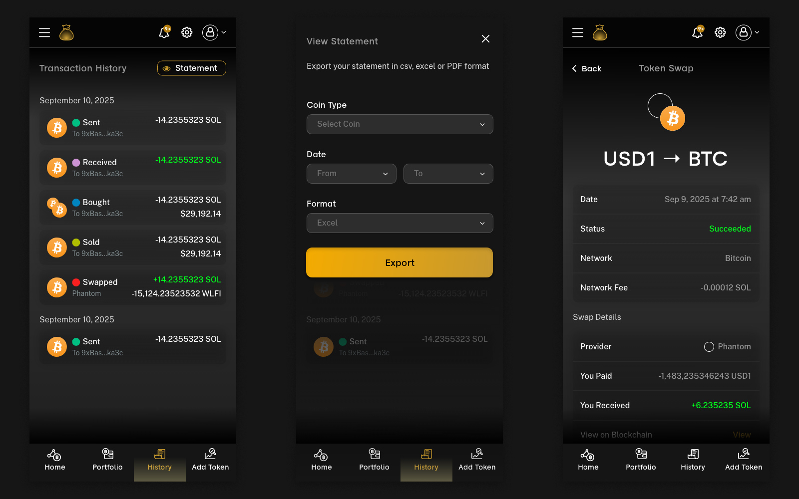
The final result was the MVP launch of a responsive web application. It features a seamless on/off-ramp, crypto-to-crypto swaps, in-app wallets, and a comprehensive notification and receipt system.
Exploration & Discovery
I started by listening to users and mapping their “Jobs to be Done.” The core insight was clear: people are not scared of money; they are scared of making irreversible mistakes.

Jobs to be Done:
I identified four key needs: safe buying, reliable cashing out, predictable swapping, and accurate tax record-keeping.
Flow & Risk Mapping
I mapped "happy paths" and edge cases, such as expired quotes or failed KYC. This allowed me to define graceful recovery patterns that keep users calm during errors.
Heuristic Review
By analyzing competitors, I pinpointed common sources of confusion, such as hidden fees and ambiguous network steps.
Constraint Alignment
I worked with the compliance team to turn regulatory hurdles into clear, reassuring UI elements rather than roadblocks.
Design System
I built a component-based system unifying dozens of entities
(profiles, wallets, projects, contracts) into one consistent framework

UX Design Process
Once I understood the risks, I translated those insights into repeatable patterns. My process focused on plain language, predictable structures, and calm visuals.
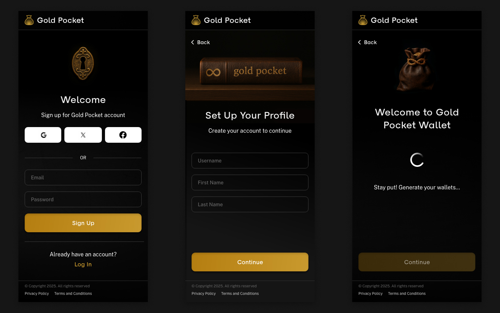
Information Architecture
I used a bank-like model to group actions by intent (Buy, Sell, Swap). This is supported by clear sections for Activity and Profile management.
Task Flows & Prototypes
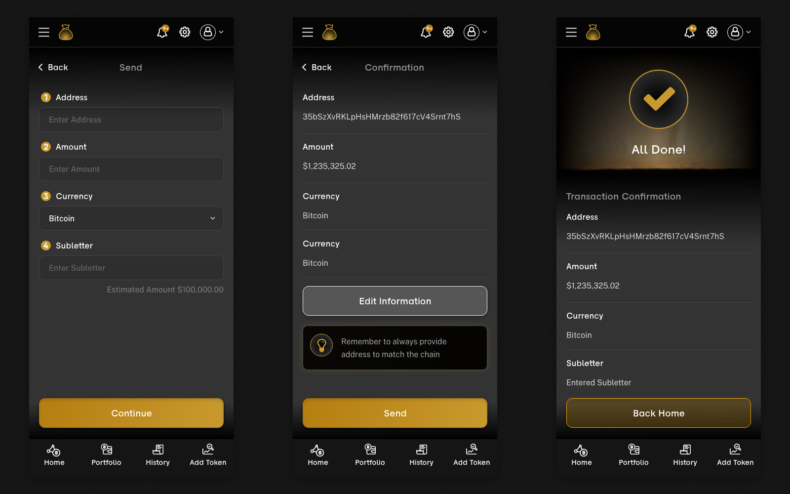
Each transaction follows a clear four-step process. This includes real-time quote timers and full fee transparency.
Content & Microcopy
The interface uses protective cues and helpful error messages that explain exactly how to fix an issue.
Trust, Safety & Compliance UX
We implemented progressive KYC, meaning users only provide information when it is absolutely necessary.
Loading & Feedback
I used skeleton loaders and honest progress cues to keep users informed during blockchain confirmations.
Final Design Direction
The final experience feels familiar on purpose. At a glance, users can see exactly what they own, what they have done, and what they can do next. I designed the product to “slow down” at critical moments – such as locking quotes or clarifying fees. This strategic friction ensures that users move forward with confidence rather than rushing into mistakes.
Furthermore, the aesthetic balances a premium feel with a sense of security. By using a dark-neutral palette with subtle gold accents, we created an environment that feels sophisticated yet approachable. This visual language avoids the “noise” often found in trading platforms, favoring a calm interface that highlights essential data and action items.

Impact & Results
By the end of the MVP phase, Gold Pocket felt both powerful and stable. Early pilots showed that users moved through complex financial flows with fewer questions and more certainty.
Clarity & Confidence
Testing showed faster "time-to-quote" and a significant reduction in user confusion.
Reduced Errors
Safety checks for network addresses and rate expiries successfully cut avoidable mistakes.
Scale-Ready System
The robust design system now allows the team to add new payment methods and assets without reinventing the wheel.