Canada Revenue Agency
As the government of Canada has been modernizing their internal and external service portals, I was contracted to come up with a vision, user experience, and visual design of the IT self service portal.
As the government of Canada has been modernizing their internal and external service portals, I was contracted to come up with a vision, user experience, and visual design of the IT self service portal.
To redesign an existing user requests portal and create a better user experience for CRA products
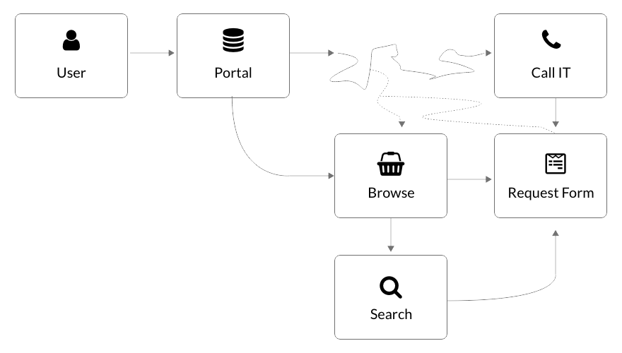
The existing internal tools were outdated and cobbled together from four different systems, resulting in an inconsistent user experience. Users frequently needed support or relied on memory to find what they needed. I had the opportunity to redesign the UX within certain limitations, enabling users to efficiently access information through improved search and navigation.


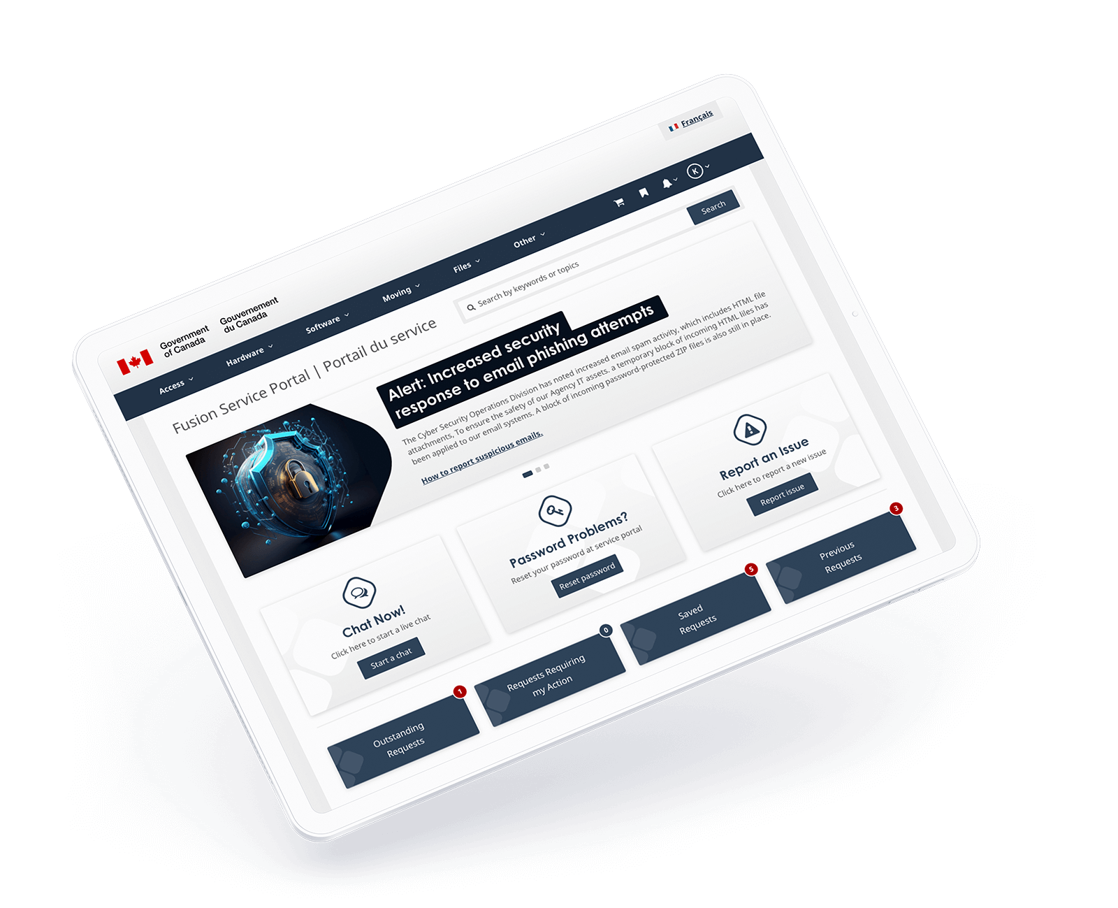
I identified two main user groups: agency users, CSIC, and IT branches of the government. The three most common tasks were chatting with IT, password resets, and reporting general issues. I prioritized these functions on the app’s homepage.

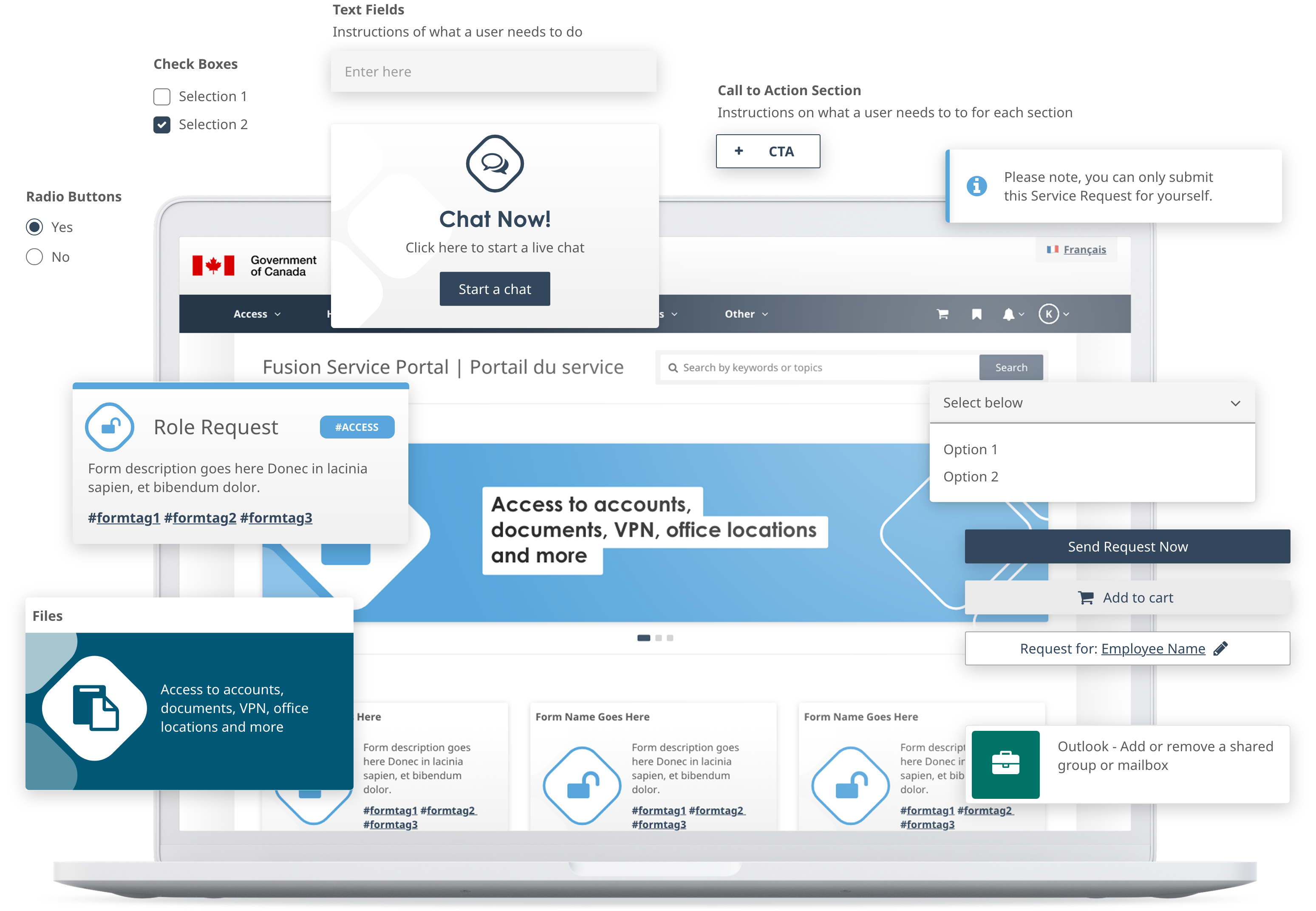
I limited the color palette to 3 base colors and 6 different category colors

In order to keep the interface as restrained as possible, I designed thin, minimalist icons.
The portal was successfully launched in 2025.
Forms Migrated
Users Migrated