Canada Revenue Agency
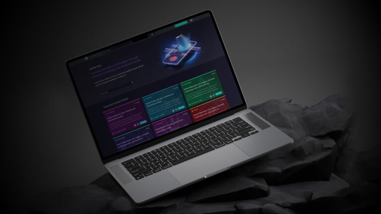
IT Self-Service Portal Modernization
Redesigning a legacy government IT Self-Service Portal into a modern, scalable platform.
The Final Result
Frictionless experience that would drive user adoption and measurable financial growth.
Project Overview
The Canada Revenue Agency (CRA) needed to modernize its internal IT self-service portal. Because the original system was built on early-2000s legacy technology, the outdated experience was difficult to navigate. This friction led to significant inefficiencies and placed a high demand on support staff. My goal was to redesign this portal into a modern, scalable platform for 75,000 CRA and CBSA employees.


My Role
Senior Product Designer
July 2023 – May 2024
I led the vision, UX strategy, and visual design for this large-scale modernization effort. During this time, I partnered with cross-functional Agile teams to transform complex workflows. Together, we modernized over 100 forms and established a scalable design system that will serve the agency for years to come.
The Problem
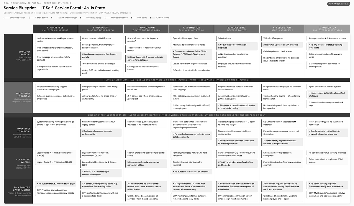
The primary issue was fragmentation. Four separate legacy systems created an inconsistent and inefficient portal experience. Consequently, employees were unable to resolve their IT needs quickly, which stalled productivity across the agency.
The Team
I worked within a cross-functional Agile team. This group included Business Analysts, designers, developers, and key government stakeholders, all focused on a unified digital transformation.
My Methods
To build a better solution, I utilized behavioral and ethnographic research. I also conducted co-design workshops, service design mapping, and rigorous usability testing to ensure every design decision was backed by user data.
The Tools
I leveraged Figma for high-fidelity design and prototyping. Additionally, I utilized specialized research frameworks and accessibility testing tools to ensure the portal met strict federal standards.
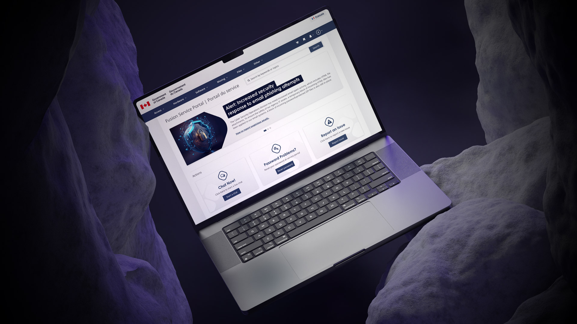
Final Design Direction
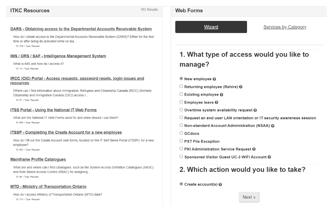
The modernized portal delivered a streamlined and intuitive platform. Employees can now easily complete common tasks, such as chatting with IT, resetting passwords, and reporting issues. The final design introduced modern navigation and a powerful search engine. Furthermore, the interface is fully aligned with modern accessibility standards to ensure inclusivity.

Design System
The final solution automated outdated processes and reduced the user’s dependency on memory or support staff.
By creating a cohesive digital service experience, we empowered employees to manage their IT needs independently.
Exploration & Discovery
To understand the challenges employees faced, I began with a deep dive into legacy artifacts. I spoke directly with end users to uncover the most common workflows. This allowed me to prioritize the improvements that would provide the highest value to the agency.

Artifact Review
I immersed myself in the legacy forms and documentation that had previously stalled modernization efforts.
User Interviews
I conducted 12 in-depth interviews with CRA/CBSA employees, IT consultants, and managers.
User Group Identification
I identified two key audiences: the general agency staff and the IT support branches.
Key Task Prioritization
Through research, I highlighted three primary needs: IT chat, password resets, and issue reporting.

UX Design Process
I used an iterative, Agile approach to translate these insights into functional solutions. Every stage was validated with users and stakeholders to ensure alignment.
Wireframes & Prototypes
I created interactive flows to test navigation and task prioritization.
Homepage Redesign
We placed high-frequency tasks directly on the homepage for immediate access.
Form Modernization
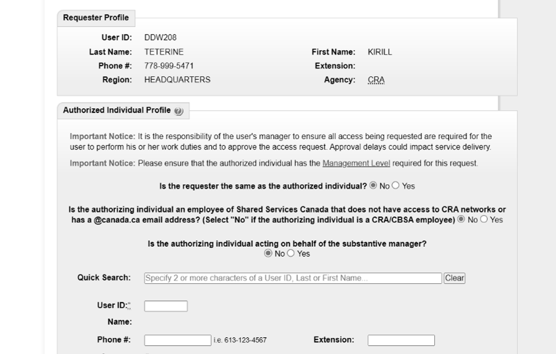
I redesigned 114 legacy forms, simplifying inputs and ensuring visual consistency.
Design System
I built reusable components and style guides to ensure scalability across all CRA products.
Accessibility Compliance
My team implemented WCAG-aligned standards to ensure the portal remains inclusive.
Responsive Design
We ensured the portal worked seamlessly across all devices used by the agency.
Testing
I ran usability sessions and surveys to validate the new flows and language.
Impact & Results
The redesigned CRA IT self-service portal went live in December 2024. Today, it serves thousands of employees daily. While funding cycles ended before long-term outcome measurement, the immediate project milestones demonstrated immense value. We successfully transformed a 20-year-old legacy system into a modern, user-centric ecosystem.
Automated workflows reduced reliance on memory and support staff.
Streamlined homepage navigation for the most common IT requests.
Shifted CRA’s internal UX team toward Agile, iterative delivery
01. Process & Research
Behind the CRA
Fusion Service Portal
Research methodology, design decisions, system architecture, and reflections from a 12-month government modernisation project.
02. The Problem
Four broken systems, one broken experience
CRA employees relied on four separate legacy platforms built in the early 2000s – each with its own navigation, language, and logic. Routine IT tasks required institutional knowledge or a helpdesk call, eroding productivity across the agency.
Fragmented systems
No unified entry point — employees had to know which of four systems handled which request before they could even begin.
Memory-dependent navigation
Staff relied on bookmarks and personal notes. No wayfinding, no search, no logical hierarchy.
High support dependency
Routine tasks — password resets, incident reporting — generated unnecessary IT tickets, creating staffing pressure.
Accessibility failures
The legacy experience failed federal WCAG obligations, creating real barriers for employees with disabilities.
“Employees were unable to resolve their IT needs quickly. Every simple task stalled productivity - and stalled previous modernisation attempts too.”
03. Research & Discovery
Understanding before designing
Government systems carry institutional weight — long-standing processes, embedded workarounds, and users who have adapted to broken tools. I committed to deep discovery before drawing a single wireframe.
Artifact review
Legacy forms
User interviews
12 sessions
Ethnographic observation
Real workflows
Co-design workshops
Stakeholder alignment
Service mapping
End-to-end flows
Key findings
Three tasks drove the majority of volume
No unified entry point - employees had to know which of four systems handled which request before they could even begin.
Navigation required prior knowledge
Staff relied on bookmarks and personal notes. No wayfinding, no search, no logical hierarchy.
Forms were the biggest barrier
Routine tasks - password resets, incident reporting - generated unnecessary IT tickets, creating staffing pressure.
Two user groups with conflicting needs
The legacy experience failed federal WCAG obligations, creating real barriers for employees with disabilities.
04. Design Process
Six phases, one direction
Every phase was validated with real users before moving forward. Design ran one sprint ahead of development throughout the Agile delivery cycle.
Information architecture
Homepage strategy, card sorting, tree testing
Wireframes & prototypes
Interactive flows, high-fidelity in Figma
Form modernisation
114 forms audited, plain language rewrites
Design system
Components, tokens, dev handoff docs
Accessibility
WCAG 2.1 AA, focus management, ARIA specs
Usability testing
Moderated sessions, post-task surveys
Design System Structure
Templates & patterns
Page layouts · Form templates · Navigation structures
UI component library
Buttons · Inputs · Tables · Forms · Navigation · Alerts · Modals
Foundations
Design tokens · Colour · Typography · Spacing · Elevation · Motion
05. Outcomes
A 20-year-old system, replaced
The portal launched in December 2024. While the contract concluded before long-term metrics were fully captured, every project milestone was delivered on schedule.
Artifact review
Legacy forms
User interviews
12 sessions
06. Reflections
What I learned
What worked
- Co-design workshops built genuine stakeholder buy-in, preventing approval-cycle stalls
- Treating the design system as a product - with documentation and governance - enabled sustainable handoff
- Embedding accessibility at component level rather than layering it on at the end
What I'd do differently
- Instrument the legacy system before go-live to establish a measurable baseline
- Advocate for a dedicated research sprint on form modernisation rather than running it in parallel
- Establish a formal design QA handshake with dev to catch implementation drift earlier